A New Identity…
CATE is a company in the infrastructure, environment and industry business, developing structural projects in several levels and offering design studies and projects of functional, basic and executive nature. We work with a team of highly experienced, competent and responsible partners and collaborators.
CATE brings through this channel a presentation of their new visual identity, and a more dynamic access to it’s experience and competence history of information.
We value quality, fair deadlines and a competitive cost. Those characteristics are the essence of a responsible company, therefore, we do not consider those skills as a differential, but as the essential. As such, we seek to always meet demands and follow the current requirements, through developing new skills and utilizing new technologies within a wide range of demands, that is, conditions compatible with the responsibility of creating simple solutions for new challenges.
Over the years, our entire team has participated and developed special projects and helped make big dreams come true.
Therefore, more than presenting of a new visual identity, with the goal to represent stability and simplicity that accompanies all the work done, it is the opportunity to register a special thanks to all the companies, partners and collaborators that were part of this course, trusting, believing and, on top of all, encouraging us. Thanks.
Nilvea Bugno Zamboni
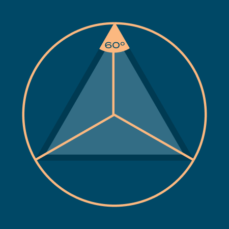
Symbology: Equilateral Triangle

Parallel Geometric Elements
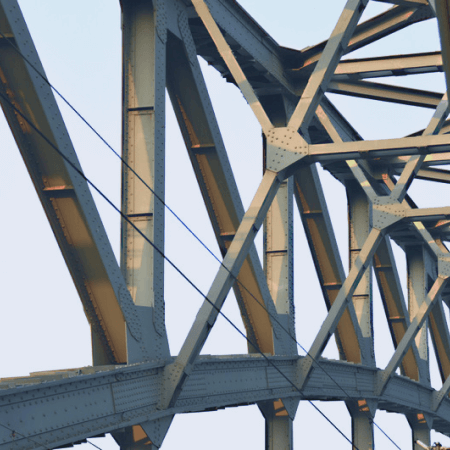
Beams and Support Structures
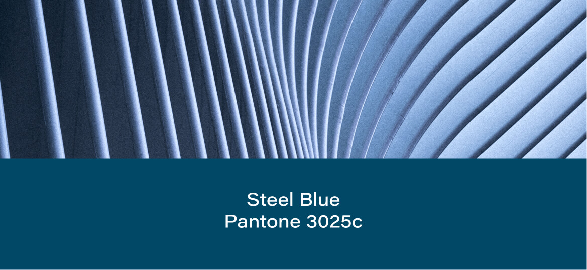
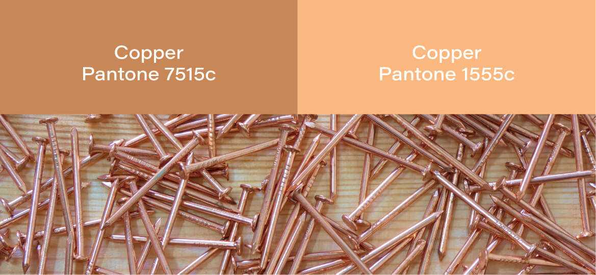
Color Inspiration
For the colors, inspiration was taken from the subtle coloring possible to observe when analyzing construction sites: the steel blue, representing sobriety, stability and confidence, and copper orange, which brings a warm contrast to the blue and a lighter texture, helping create a smoother brand appearance.